Lead with Your CTA: The Upside-Down Homepage Strategy That Converts
I bet your homepage is the most visited page on your website. It’s where your visitors land to find out what you’re all about…and take the next step or disappear forever.
That’s a lot of pressure for one page!
Sadly, the average homepage flows something like this:
Here’s what we do…here’s why we’re the best…buy our stuff…look at our blog and other resources.
Somewhere at the bottom, usually above the footer, is a call-to-action to get the newsletter.
Just because this is the usual way to structure a homepage doesn’t mean it’s the best way.
The problem is that people think their homepage needs to immediately show everything they have to offer. But too many options easily lead to decision fatigue in your visitors…and they’re gone.
Instead, I propose optimizing your homepage for the number one thing you want people to do.
And that should be joining your email list. (I won’t repeat why building your email list is so crucial. It’s your most important marketing asset).
Now, you might think the most important thing for people to do is buy what you have to offer. Realistically, most people who land on your website for the first time won’t make a purchase. They aren’t ready yet.
You want them on your email list because from there you’re in control of their experience. You can educate them and deliver the information they need to decide whether your offer is right for them or not.
That’s why you should build your homepage “upside-down” which means showing your visitors your main CTA right away.
After I first heard about this concept in this blog post, I implemented it on our fortelabs.com and buildingasecondbrain.com homepages.
The main CTA on buildingasecondbrain.com is the Second Brain Quickstart Guide which currently boasts a 13.3% conversion rate and has added over 30k subscribers alone to our email list.
But is 13.3% a lot? It is! Looking at benchmarks online, a 5% conversion rate is typically considered pretty good.
To show you what an upside-down homepage looks like in practice, I’ve broken down the buildingasecondbrain.com homepage into its components…
The Hero Section

The hero section is what’s “above the fold” on your homepage – what visitors see without having to scroll down.
The page starts with our key message and the immediate CTA to sign-up for our most successful lead magnet, the Second Brain Quickstart Guide.
It also includes social proof in the form of logos of media outlets BASB has been featured in. This could also be clients you’ve worked with or your most powerful testimonial. What’s important is that this section immediately signals your visitors that this is someone/a company they can trust.
The Problem

From there, the homepage continues with a story to meet our visitors where they’re at.
We want to show that we understand their pain points and struggles, which in turn will make it more likely that they’ll trust us to know the solution.
The Solution

Next, we contrast the problem with the solution and its benefits. Notice how we haven’t even mentioned a specific product yet. First, the visitors need to be sure that the solution itself is the right one for them.
At this point, we’re repeating the main CTA, boosted by a testimonial.
The Who

Still, why should someone want to learn from / work with you? It’s time to introduce yourself.
This is Tiago’s bio…but not the standard one that you might find in his books. It’s a selective story that fits within the context of this particular page and tells the reader what they need to hear at this point.
You might have noticed that it’s written in the first person. Most websites write bios in the third person, probably in an attempt to sound more authoritative. I’ve always preferred the first person which seems more personable and approachable.
We’ve also included another section with recognizable logos as social proof.
The Offer

Only now are we introducing our offers: two books and two online courses. The buttons lead to the individual sales pages for each offer.
Testimonials
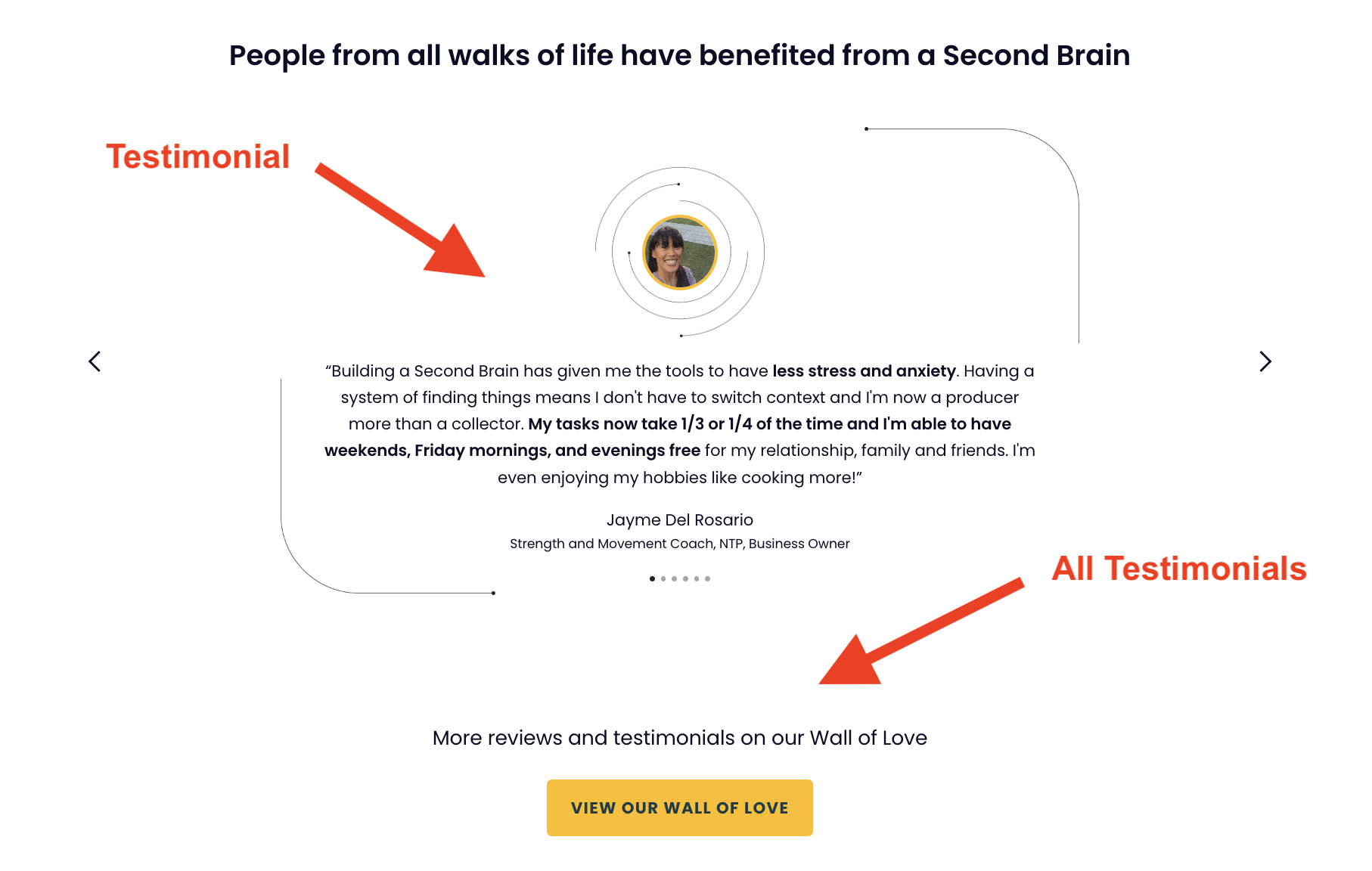
We picked some of the most powerful testimonials for Building a Second Brain and positioned them right below the offer section. There’s also a button leading to our Wall of Love which contains all testimonials. (We created this Wall of Love with the help of testimonial.to if you’re curious.)
FAQs

Chances are someone still has questions if they reach this section near the bottom of the page. We answer those in an FAQ section that purposefully addresses the main objections people have around Building a Second Brain.
Final CTA

We’re finishing off the page with one last CTA. And that’s it! Below this, you’ll find the footer of the page.
Now, It’s Your Turn!
I invite you to test an upside-down homepage for yourself. Make your main CTA the hero of the page!
Let me know if your conversion rate increases (it should!)